The graphical Nextion HMI menu

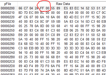
After starting with a simple status bar, then adding a simple, text-based menu, and extending and optimizing its functionality in two more articles, I owed still a pictogram based, graphical version to my dear readers. Not wanting to reinvent sliced bread again, I coded this based on the last version of the filtered text menu version, and I was surprised about the only few changes which were required. To understand every detail, please make sure that you read all the previous menu-related articles as listed below! The biggest work was creating a single 960 x 30px picture resource which acts as a container for a blank filler and 23 pictograms, all in 40 x 30px format. You may re-use it as is, or modify and extend it to taste.
Here is everything which should have been read before:
The Nextion status bar – advanced programming – Nextion
Add a menu to your Nextion Project – advanced programming – Nextion
The Nextion HMI menu – dynamically extended – Nextion
The Nextion Menu – now filtered! – Nextion
The structure of the menu configuration data has changed: instead of the target page id, a semicolon and a menu text in each line, its now still the target page id and a semicolon, but then, its simply another number, the icon index: If it’s 0, that means the first sub-pic in the resource, 1 the second, which starts at x=40, 2 the third at x=80 and so on:
 0 1 2 3 4 5 6 7 8 9 10 11 12 13 14 15 16 17 18 19 20 21 22 23
Thus, the global menu configuration variable cfg_menu is still multiline because we maintained the csv-like structure, but it’s now
0;1   // Start page id=0 with icon=1
2;3   // Settings page id=2 with icon=3
5;17  // About page id=5 with icon=17
Similarly, we find now the individual addition for the start page in the event code of the hotspot m0 as follows:
// optional: add individual menu items
menu.cfg_add.txt="3;11\r4;20"
This gives us the addition of the Sub 1 page id=3 with icon=11 and the Sub 2 page id=4 with icon=20.
That makes a total of 5 menu items, but the recently added filter makes that if called from a page, its corresponding menu item will be skipped. Thus, only the 4 “true” links towards other pages are displayed.
As before in the text version, the menu is normally invisible to prevent wasting screen estate, only when someone clicks on the menu “hamburger” in the top right corner of a page, the blank and transparent menu overlay page will be loaded and the menu icons will be drawn with the xpic command, according to the current common and additional menu configuration.
The only difference is that now, since we draw the icons horizontally at the bottom instead of writing text items vertically right-aligned, the menu page preInitialize code which sets the start coordinates for the drawing is modified as follows:
// initialize draw variables
menu_x.val=0 // start left
menu_y.val=b[0].h-30  // at the page bottom
Then, the routine for parsing the menu configuration and for drawing the icons accordingly in the menu page postInitialize event has been adapted:
// let's check if there is a menu addition from the calling page
strlen cfg_add.txt,tmp2.val
// if yes, append it to the common menu configuration
if(tmp2.val>0)
{
  cfg_menu.txt+="\r"
  cfg_menu.txt+=cfg_add.txt
}
// *** from here, it's similar, but instead of placing text items
// vertically, we place pics horizontally ***
// draw the menu close in the top right corner
xstr b[0].w-tb_h,0,tb_h,tb_h,0,tb_pco,tb_bco,1,1,1,"✕"
// list a maximum of 9 menu items
// only 8 will be visible, but one may be skipped by the filter
for(tmp.val=0;tmp.val<9;tmp.val++)
{
  // get the menu item
  spstr cfg_menu.txt,item_buf.txt,"\r",tmp.val
  // extract the icon index
  spstr item_buf.txt,item_text.txt,";",1
  covx item_text.txt,icon_index.val,0,0
  // extract the page index
  spstr item_buf.txt,item_text.txt,";",0
  covx item_text.txt,item_index.val,0,0
  if(item_index.val==call_page.val&&menu_skip.val==255)
  {
    // save the index of the skipped item
    menu_skip.val=tmp.val
  }else
  {
    // draw the menu item or a blank filler
    xpic menu_x.val,menu_y.val,39,30,icon_index.val*40,0,0
    menu_x.val+=40
  }
}
And finally, the menu TouchPress event code has been adapted to the modified screen positions of the menu items:
// check if the click was within the visible menu area
if(tch1>menu_y.val&&tch0<menu_x.val)
{
  tmp2.val=tch0 // compute the index of the clicked menu item
  item_index.val=tmp2.val/40
  // add 1 for the index if a previous item was skipped
  if(item_index.val>=menu_skip.val)
  {
    item_index.val++
  }
  // get the corresponding menu item
  spstr cfg_menu.txt,item_buf.txt,"\r",item_index.val
  // extract the page index
  spstr item_buf.txt,item_text.txt,";",0
  covx item_text.txt,tmp.val,0,0
  // go to the page
  page tmp.val
}else
{
  // return to calling page
  page menu.call_page.val
}
That’s it. Not much different from the text based menu version but for some, the result might be more appealing, especially since for pictograms, no translation is required in multi-language environments!
As always, here the demo project code to study, to play with it, to re-use it partly or entirely in your own project: add_menu_graph.HMI
Thank you for reading and happy Nextioning!
Questions, comments, critics, suggestions? Just send me an email to thierry (at) itead (dot) cc! 🙂