The Sunday Blog: Understanding and Customizing HMI components
Part 8: Extend an existing component – the animated progress bar
Remember the previous readings? We saw how to design a custom component for our NEXTION HMI from scratch and we learned about animating graphics using a timer component. Today, with this knowledge, we will extend the functionality of an existing component, the progress bar, and give it a more appealing look with animated graphics like in this video:
The advantage of extending an existing component over creating one from scratch is that we don’t need to define all the static properties of the component as we did last week, we just use the editor to place the original component on a page and then, we only need to add a few helpers and some code and we are done.
Our code is then able to read all the attributes of the original component and uses these inside the overloaded initialization and update procedures which we’ll again hide in the Touch Press and Touch Release events of a small, invisible hotspot as a code container. The “click” command will allow us to call our functions whenever we need them. The second helper, a timer component, has a double function: It will care about the animation and about changes of the val attribute, so that our animated progress bar will react in real time on changes, set by the Nextion code itself like in our demo hmi file, or sent by an external MCU, i.e. an Arduino.
How a progress bar component works
Basically, it’s simple. A progress bar is a rectangle which is filled from the left to the right with the plot color (the pco attribute). The remainder of the rectangle is then filled with the background color (the bco attribute). The width of the active part depends on the component’s value (the val attribute) which can vary between 0 and 100. The effective width depends on the component’s overall width and is calculated internally by the firmware to w * val / 100.
Starting with a pattern
Now, in a first step, before thinking about animating whatsoever, we’ll need to replace the monochrome rectangle by a repetitive pattern. Thus, we create a little square graphic which can be repeated ad infinitum, either horizontally or vertically. I used (as usual) Gimp 2.10 to create the 30*30px tiles for horizontal and vertical progress bars and which are imported as the picture resources 0 and 1 in the Editor:
What we need to do now, is simple: Taking the val and with attributes and calculate the length (which is the width for a horizontal and the height for a vertical progress bar) to be filled by repeating the corresponding tile. It might be that the length is not an entire multiple of our tile dimension, so we need to check if there is a remainder and use cropping techniques to draw the last tile only partly.
Animating everything
We want to give the impression that our repeated tiles move. This can be obtained by using a loop which, after drawing the first tile entirely in the first run, crops and draws only a part of the first tile which decreases each time. This has naturally an impact on the number of full tiles to be drawn afterwards, and on the fraction of the last tile at the end, because the overall length has to remain always constant for a given progress value. After the fist tile has fully disappeared, we have to start over with a full tile.
Declarations
The needed internal variables for that are declared in the program.s file and are prefixed with an underscore. That’s a convention to show that the variable is internal and should not be modified by the user.
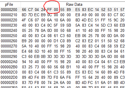
int _j0_l    // drawing length (scaled val attribute) and helper var
int _j0_dp   // drawing pointer (location of the next square)
int _j0_do=0 // drawing offset
int _j0_d1   // remainder 1st square
int _j0_dn   // remainder last square
int _j0_i    // loop variable
int _j0_dim  // dimension, either h if horizontal, else w if vertical
page 0       //Power on start page 0
Initializing the component
Initializing our animated progress bar is short and simple, the initialization code in the Touch Release event of our hotspot consists of just a few lines, which use the vis command to hide the original component (who needs colored rectangles when we can have a nice animation?), sets a dimension helper variable depending of the progress bar’s dez attribute which is 0 for horizontal and 1 fo vertical, and it starts the internal animation timer who updates our component periodically:
vis j0,0      //hide the original component
if(j0.dez==0) //horizontal
{
_j0_dim=j0.h
}else         //vertical
{
_j0_dim=j0.w
}
_j0_tm.en=1
The animation timer
In its event code, we just increase each time the drawing offset a little and we use the modulo function with the tile dimension, so that it starts over and over again for a fluid movement and we call the update function:
_j0_do+=2%_j0_dim
click m0,1
The drawing routine(s)
Since the drawing routine differs strongly for horizontal and vertical progress bars, we’ll need two code blocks and a if/else construction to differentiate between the horizontal and vertical modes. The proceeding is always the same as described above :
- set the drawing pointer to the beginning
- calculate the overall drawing length
- calculate the crop part of the first tile with respect to the offset value
- if this is already longer than the drawing length (small val attribute), shorten it more
- calculate the remaining drawing length and divide it by the tile dimension to get the number of entire tiles
- use the modulo function to get the part of the last tile
- draw the first tile or its part, depending on the offset and advance the drawing pointer accordingly
- draw the required number of entire tiles and advance the drawing pointer accordingly
- draw the last tile or its part, depending on the offset and advance the drawing pointer accordingly
- fill the remaining space with the background color
And that’s how it looks in Nextion code :
if(j0.dez==0)
{
  _j0_dp=j0.x // drawing start position
  _j0_l=j0.val*j0.w/100 // overall drawing length =scaled val to width
  _j0_d1=_j0_dim-_j0_do // width of the 1st square
  if(_j0_d1>_j0_l)
  {
    _j0_d1=_j0_l
  }
  _j0_l-=_j0_d1 // remaining drawing width
  _j0_dn=_j0_l%_j0_dim // width of the last square
  _j0_l=_j0_l-_j0_dn/_j0_dim // number of full squares in between
  xpic _j0_dp,j0.y,_j0_d1,_j0_dim,_j0_do,0,0 // draw the first partial square
  _j0_dp+=_j0_d1 // move the drawing pointer forward
  for(_j0_i=0;_j0_i<_j0_l;_j0_i++)
  {
    xpic _j0_dp,j0.y,_j0_dim,_j0_dim,0,0,0 // draw a full square
    _j0_dp+=_j0_dim // move the drawing pointer forward
  }
  xpic _j0_dp,j0.y,_j0_dn,_j0_dim,0,0,0 // draw the last partial square
  _j0_dp+=_j0_dn // move the drawing pointer forward
  _j0_l=j0.w+j0.x-_j0_dp // remaining for the background rectangle
  fill _j0_dp,j0.y,_j0_l,j0.h,j0.bco // draw the background
}else
{
  _j0_dp=j0.y // drawing start position
  _j0_l=j0.val*j0.h/100 // overall drawing length =scaled val to height
  _j0_d1=_j0_dim-_j0_do // height of the 1st square
  if(_j0_d1>_j0_l)
  {
    _j0_d1=_j0_l
  }
  _j0_l-=_j0_d1 // remaining drawing height
  _j0_dn=_j0_l%_j0_dim // height of the last square
  _j0_l=_j0_l-_j0_dn/_j0_dim // number of full squares in between
  xpic j0.x,_j0_dp,_j0_dim,_j0_d1,0,_j0_do,1 // draw the first partial square
  _j0_dp+=_j0_d1 // move the drawing pointer forward
  for(_j0_i=0;_j0_i<_j0_l;_j0_i++)
  {
    xpic j0.x,_j0_dp,_j0_dim,_j0_dim,0,0,1 // draw a full square
    _j0_dp+=_j0_dim // move the drawing pointer forward
  }
  xpic j0.x,_j0_dp,_j0_dim,_j0_dn,0,0,1 // draw the last partial square
  _j0_dp+=_j0_dn // move the drawing pointer forward
  _j0_l=j0.h+j0.y-_j0_dp // remaining for the background rectangle
  fill j0.x,_j0_dp,_j0_l,j0.h,j0.bco // draw the background
 }
doevents
As usual…
You don’t have to copy/paste everything into the Nextion Editor. You can download the project hmi file which also includes demo functions in the Nextion forums and play around with it. And you are naturally free to re-use it in your own projects. Thank you for reading!