The Sunday Blog: Understanding and Customizing HMI components
Part 5: Custom switches and enhanced radio buttons
This week, we’ll continue learning techniques for efficient and resource saving GUI design. This week’s example project requires just 72 bytes of the 3584 precious ram bytes, although we have three switches and five radio buttons on our screen. While the generic Switch component is only available on the Intelligent P series screens, and while the generic Radio components don’t de-click one another, everything here is realized as usual on a simple NX4024T032_11 Basic series screen!
The 2FSP GUI technique
2FSP stands for “Two Full Screen Pictures”, one being the default page background and showing all GUI elements in their passive or disabled state, and one showing all elements in their active state. That saves a huge amount of Nextion system resources because you’ll need only less and simpler components while the look of your GUI is fully customizable. For example, don’t waste memory for a static text label, just put the text on the background. Or, don’t fiddle with 100s of little pictures for your components, put everything on the two full screen pictures where they won’t eat up neither RAM nor other system resources. Your GUI will be easier to maintain, to customize, and you’ll probably see increased execution speed due to lower resource usage.
A prerequisite is having and mastering a powerful pixel graphics program. It should allow you to work with multiple layers which you can show and hide to check the active and passive state of each component. It should allow you the use of so-called guides, first for well aligning the components within the screen, and second for making sure that the active and the passive version of a component won’t jump by a few pixels when their state changes. MS Paint and PowerPoint are definitively not the best tools to use, both lack guides/grids and layering, and PowerPoint’s auto-scaling features will make quite sure that your GUI looks very different on the Nextion HMI from what you had on the screen.
Not everybody wants to spend money on PhotoShop, that’s why I recommend and use myself The Gimp 2.10, a freeware which runs under Windows, Mac, and Linux and which fulfills all requirements cited above. Once you have understood the layer and layer group concept, you’ll start putting each component on an individual layer to allow moving it around later (yes, you should have thought about that before, but sometimes…) and to group all passive versions of the components in one layer group and the active ones in another layer group.
Designing the GUI
“A picture says more than thousand words” is a well known saying. Thus, I present you just two pictures, the first with the passive version and the second with the active version visible while the respective other is hidden:
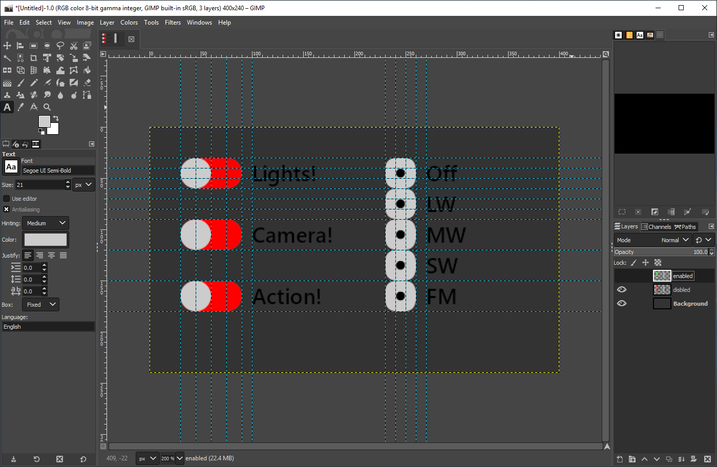
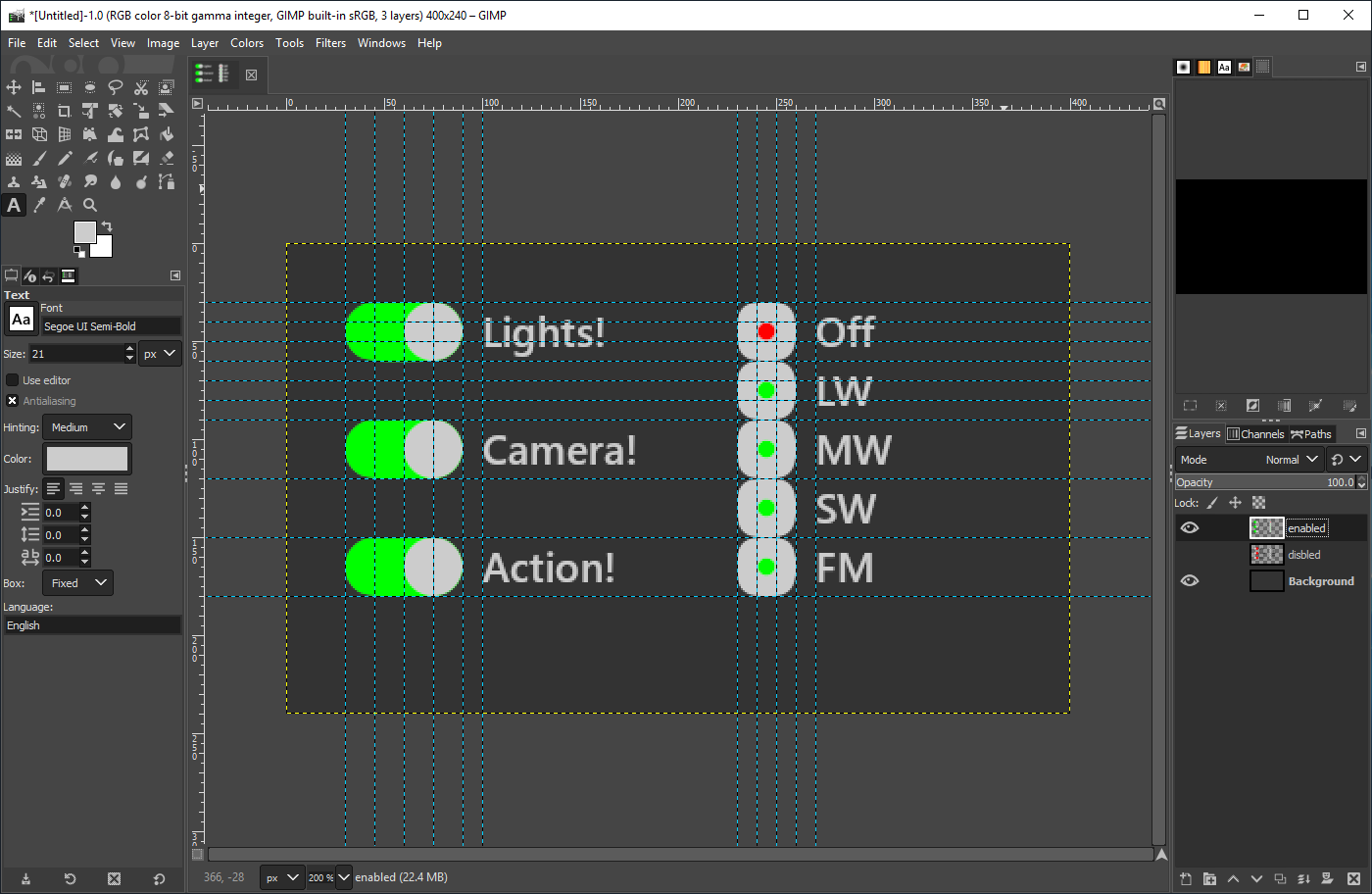
The oval forms for the switches were made by combining a rectangular selection in the middle and two circular selections at the ends, converting this selection to a path, and filling it finally either with red or with green. The switch knob is just a circular selection to a path and filled with clear grey.
The radio buttons started as rectangular selections with rounded corners, again to path, and filled with clear grey. the dots in the middle, you guess it, circular selections, to path and filled with the respective colors. “It aint not no rocket science”…
After exporting the two variants as bmp files with RGB565 color encoding, we can move over to…
The NEXTION Editor
… where we set up our project and import these two bmp files. We attribute the first (passive) as the page background for page0 and place 8 Crop components above our designed controls as shown below.
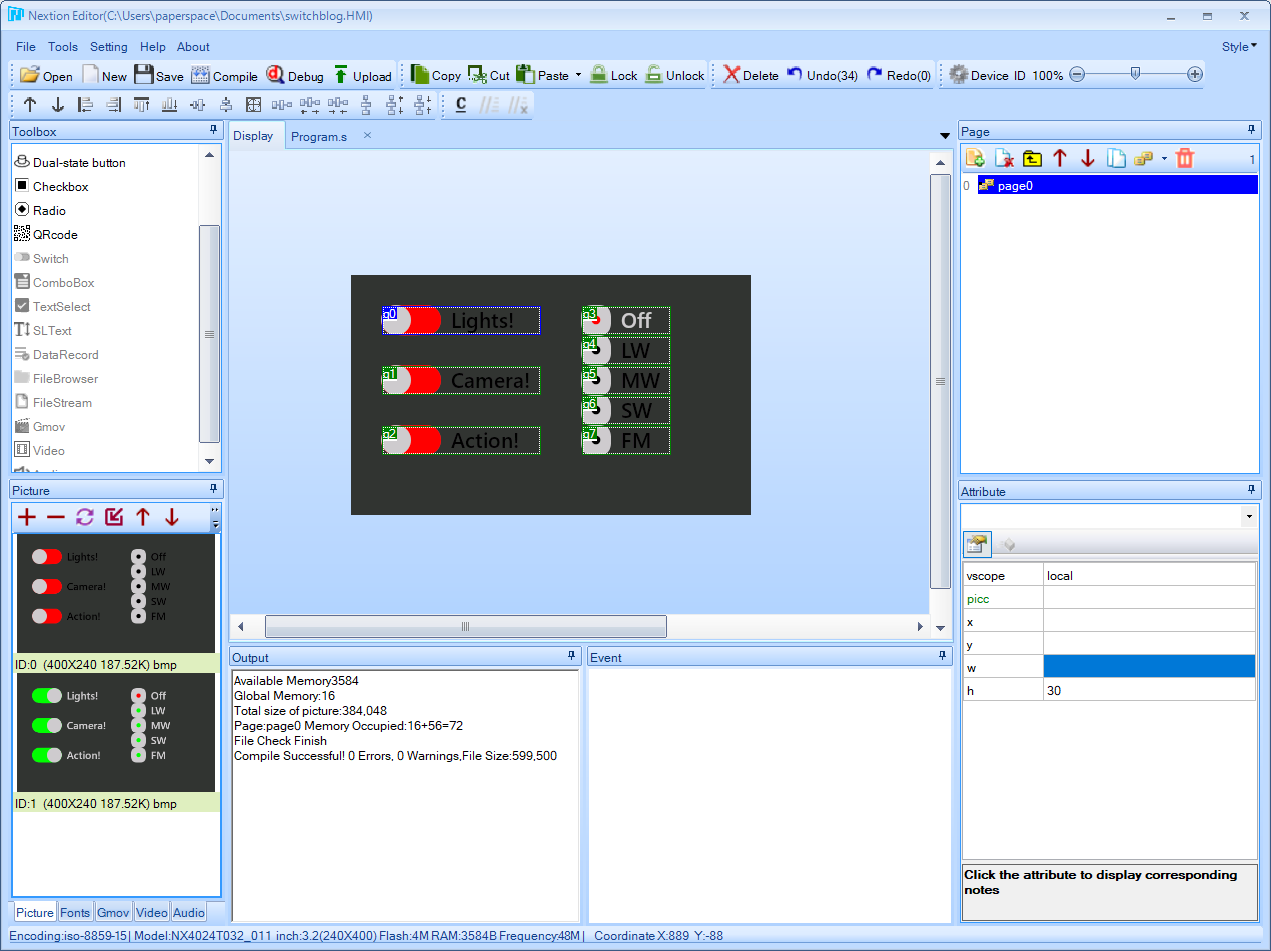
The Crop component is very similar to a Picture component, but it doesn’t render its own local picture, it takes just its own “cutout” from a full screen picture. Now, you see the trick. As long as the Crop’s picc attribute is identical to the page background, it will show the passive component state. As soon as you set it to a different full screen picture resource, in our case 1, it will show the active state within its boundaries without affecting the surroundings.
Coding for the switches in the Touch Press event is a one liner, since you have just to toggle the picc attribute between 0 and 1:
q0.picc=1-q0.picc
and naturally similar for q1 and q2.
For the radio buttons, we have to define first the default state when the page is loaded, so we set q3’s picc to 1 in the editor (and all others to 0) and save that state also in the page Post Initialize event to the global variable sys0, so that the other buttons’ event code will know which button was previously active and has to be switched of when a new one is pressed:
sys0=q3.id // sys0 keeps the current radio button id
Now, the Touch Press event code:
if(q3.picc==0) // act only if the button wasn't active when touched
{
  b[sys0].picc=0 // switch the previous radio button off
  q3.picc=1 // set this radio button on
  sys0=q3.id // save this as the previous button for the next click
}
and again similar for q4, q5, q6, and q7.
That’s it! As usual, you might download the zipped HMI project in the Nextion forums. Have fun!